Documentation & DX / Tutorial
The README Is Your Landing Page: Structure for Open-Source Projects That Want Contributors
How to structure a README that converts a curious visitor into a running install, then into a first contribution.
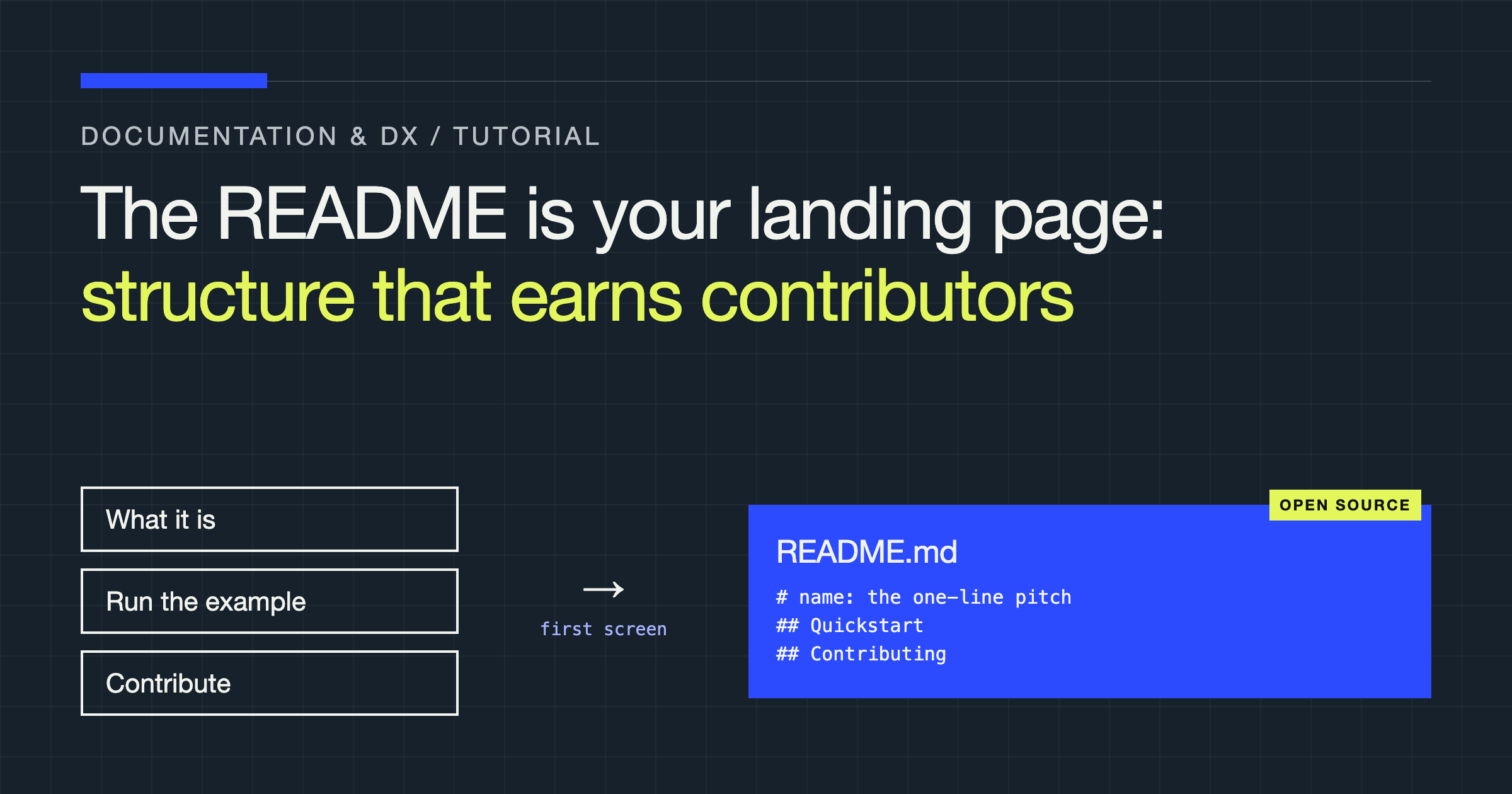
By the end of this guide, you will know how to structure a README that does the two jobs an open-source project actually needs from it: get a visitor to a working install with minimum friction, and show a potential contributor exactly where they fit. Most project READMEs attempt a third job instead, describing the project thoroughly, and end up doing none of the three well. A README is a landing page, and it should be built with a landing page’s discipline: one audience arriving with one question, a fast answer, and a clear next action. The question your visitor arrives with is never “tell me everything.” It is “what is this, does it solve my problem, and can I get it running?”
The first screen decides everything
A visitor gives the top of your README a few seconds and a scroll. In that space they must learn what the project is, in terms of the problem it solves rather than the technology it uses, and see evidence that it works: a short example, a screenshot, a demo, whichever form shows the outcome fastest. “A library for parsing configuration files” is a description. “Stop hand-writing parsers for configuration files: declare the shape, get validated values or a readable error” is a pitch, and it answers the visitor’s real question, which is whether this project removes a pain they recognise.
Resist opening with badges, build status, contributor counts, and licence furniture. That material has a home further down, where the already-interested reader looks for it. Opening with it spends your only guaranteed attention on reassurance for people who have not yet been given a reason to care. Lead with the problem and the proof. Everything else queues behind them.
The structure, in order
A reliable README follows the order of the reader’s journey. First, the one-paragraph pitch: what it is, what problem it removes, who it is for. Second, the smallest possible working example, because nothing persuades like seeing the thing used. Third, installation, kept to the shortest path that genuinely works, with prerequisites stated before the command that needs them rather than discovered by it failing. Fourth, the most common real-world uses, briefly, with links to full documentation for depth. Fifth, how to contribute, written for someone who has never contributed to the project. Sixth, the licence and project housekeeping.
Each section earns its place by answering the question the reader has at that point in the journey, and the order is the argument. Move contribution details above installation and you ask for labour before delivering value. Bury installation under architecture discussion and you lose users who would have adopted the project in the time it took to scroll. When in doubt about a section, ask which reader it serves and what they were doing immediately before they needed it.
The example is the product demo
Your quick example carries more persuasive weight than any feature list, so write it like the demo it is. It should be the shortest complete use of the project that produces a recognisable result: real input, real code, real output. Trim it until removing one more line breaks it, then stop. Annotate only the lines whose purpose is not obvious, and make sure the example is the same code your tests or your own verification actually runs, because an example that has drifted from the current interface is worse than no example: it converts an interested visitor into a frustrated one at the exact moment of first contact.
Show the output as well as the input. Readers judge a tool by what comes back from it, and an example that ends at the call leaves the most important question unanswered. If the project is visual, the screenshot or recording belongs here, captioned with what the reader is looking at, not parked in a gallery further down the page.
Installation: the shortest honest path
Installation instructions fail in predictable ways: prerequisites mentioned after they are needed, several install methods presented as equals so the reader must choose before they can judge, and steps that assume tooling the target audience may not have. Fix all three the same way you would fix a quickstart. Choose the one method most new users should take and present it as the path. State every prerequisite before the first command. Give the reader a verification step, one command whose output proves the install worked, because “installation complete” is a claim the reader should not have to take on faith.
| Section | Reader’s question | Failure mode to avoid |
|---|---|---|
| Pitch | What is this and why should I care? | Describing the technology instead of the problem solved |
| Example | What does using it look like? | A fragment that never shows a result |
| Installation | Can I get it running? | Prerequisites revealed by failing commands |
| Usage | How do I do the common things? | Trying to document everything instead of linking to depth |
| Contributing | Where would I fit and how do I start? | A link to a guide the reader must already understand |
Contributing: write the doorway, not just the link
“Contributions welcome” followed by a link is the README equivalent of a shop sign that says “open” over a locked door. A contributor-facing section should answer, on the page, the questions a newcomer actually has: what kinds of contribution the project needs, where the good starting points are, how to set up a development environment, and how a change gets proposed, reviewed, and merged. You do not need length here; you need specificity. Naming the kinds of help wanted, documentation, tests, triage, a named area of the codebase, tells a reader with an hour to give whether that hour fits. Pointing to where first issues are labelled tells them where to spend it.
Set expectations about response and review with the same honesty. A small project that says reviews happen as maintainers have time will keep more goodwill than one that implies a process it cannot sustain. Contributors forgive slow; they do not forgive silent, and they rarely return after a first contribution disappears without a word.
Keep the depth out and the links honest
The README should not attempt to be the documentation. API references, configuration catalogues, migration guides, and troubleshooting archives all belong in the docs, linked from the points in the README where a reader’s question naturally becomes a deep one. This restraint is what keeps the page maintainable: a README that tries to hold everything rots in sections, and a rotten section quietly discredits the accurate ones around it. Every link you include is a promise; check that it still leads where the text claims, and prefer fewer, verified links over a comprehensive directory nobody has audited.
Maintenance, finally, is a writing task you schedule rather than a virtue you hope for. The example, the installation path, and the contribution route are the three sections that break when the project changes, so they are the three to re-verify whenever the interface, the tooling, or the process moves. A README whose example still runs is a README a visitor can trust, and trust, extended in the first screen, is what turns visitors into users and users into contributors.
Two audiences, handled honestly: users who stay, evaluators who compare
Some maintainers resist the landing-page framing because they feel a README should serve the community rather than sell to it. That is a false choice, and the structure above is the proof. The evaluator comparing three similar projects is a future user doing due diligence; the fastest way to serve them is the same pitch, example, and installation path that serves the person who arrives already convinced. What evaluators additionally need, and what you can give them cheaply, is legibility about the project’s state: whether it is actively maintained, which versions are supported, and where its limits are. A short, honest note on what the project does not do, or where a companion tool is the better fit, converts surprisingly well. It signals maintainers who understand their own scope, which is precisely what an evaluator is trying to judge.
Users who stay, meanwhile, need the README to keep one promise after adoption: that it remains the reliable index into everything else. Keep the links section curated as the project grows, retire links to superseded guides rather than letting them accumulate, and let the README’s table of contents reflect the questions new users actually bring, which you can learn from the issues and questions the project receives. A README maintained this way becomes the project’s front door and its map at once, and both jobs reinforce each other: the map is trustworthy because the door is kept clean.
Verdict
Structure the README as the landing page it is: : pitch the problem, prove it with the smallest working example, give the shortest honest installation path with a verification step, cover the common uses and link the depth, and write the contributor doorway in full sentences rather than a hopeful link. Keep it lean enough to stay true. Projects rarely lose contributors because the code was unwelcoming; they lose them at the front door, in a README that described everything and guided nothing.